|
Lithosphere's Portfolio
The following are just a few examples of our work. If you
would like to know more about the work we carry out, please visit
the products section.
Move your mouse over the pictures below for a brief description or click for a full
description.
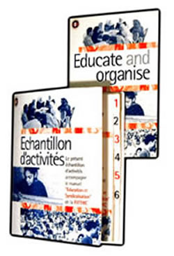 |
Activities
pack
Client:
International Textile, Garment & Leather Workers' Federation
Design:
Artloud
Quantity:
4,000 in each of 3 languages
Published:
June 2000
|
Technical: 600 micron white polypropylene binders. Silk-screened in 2 specials with a two- D-ring mechanism fitted to take 72 leaves of text and 6 gloss laminated dividers. Collated and overseas freighted to Oslo and Brussels for onward distribution world-wide. This project came through Labour & Society International, and maintains the link with our roots as printers to Third World Campaigns, originally as the Print Department of War on Want in the 1970's.
top |
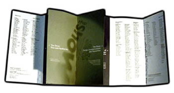 |
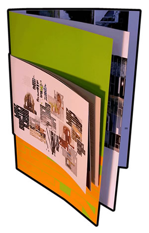
Degree show catalogue
Client: Royal College of Art Design: Brick
Quantity: 4,000
Published: Every year from June 1999 to present. |
|
Technical: 280pp text on 170gsm matt art, with 350 4-colour art illustrations and images, split into two parts with internal 4pp divider on 200gsm matt laminated board, thread sewn and wrappered, with matt laminated and blind embossed covers. Double-creased to form 2 closed-gate fore-edge spines. This publication is the portfolio for 350 top-notch art post-graduate clients in one publication, and not one complaint received! The RCA came to us originally to ask us to lecture to their students on environmental issues in printing and then to judge their work. The relationship continues.
top |
|
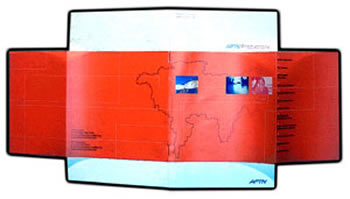
TV prospectus
Design: Ranch Associates
Quantity: 2,000
Published: October 2000
|
|
Technical: A complex 24pp brochure on 200gsm matt art, with an 8pp jacket that required printing in 6 litho colours (including oxidation-drying super opaque white) on a 100gsm transparent paper, to fit around an inner cover with inside back cover glued pocket on 350gsm matt art. Alternate leaves are half-depth and needed to stitch, along with the jacket, aligned halfway up the full depth pages - only imaginative die-cutting could achieve this. Bespoke printing of blue-chip ephemera at its most technically challenging.
top |
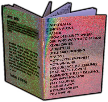 |
Artefact
Client: Jeremy Deller, artist
Design: Herman Lellie & Stefania Bonelli
Quantity: 1500
Date: 2004
|
Technical: Retouching, colouring-up, adjustments and amendments throughout as required. A5 saddle-stitched booklet. Cover is black oxidation ink on 240gsm Miri Snow, a holographic metallised board. Text is full colour on 130gsm matt coated.
Commentary: This publication, The Uses of Literacy, was originally an exhibition of art works produced by fans of the Manic Street Preachers. Current Turner Prize nominee, Jeremy Deller, is famous for his collaborative art works, and this is one of them. We are proud that our Production Director, Jim Pennington, was able to provide technical assistance on this publication. Now in reprint. This continues our record of being picked by Turner Prize Winners to print for them; we handled Chris Ofili’s Exhibition Catalogue in 1999, the year he won.
top |
| |
|
|
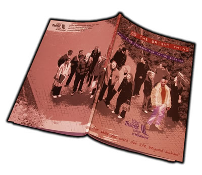
Prospectuses
Client: West Thames College
Design: Marketing Dept, West Thames College
Quantity: 20,000
Date: 2004
|
|
Technical: 80pp A4 perfect bound. Full colour plus seal throughout. Cover on 300gsm silk coated and matt laminated with spot ultraviolet dried varnish. Text on 135gsm silk coated with last leaf perforated.
Commentary: A truly vibrant sample of the genre, with perfectly executed use of coating process opportunities on the cover design. You really do have to be something of a Renaissance Man nowadays to assist the typical further Education Institution to produce their Prospectus; anything from creatively assisting with the drawing-up of the specification to a tight budget - through the photography, sub-editing, proof-reading, pre-press, press, and post-press processes - to the multiple-site logistics of distribution. On time, on budget, on spec. Our Peter Hillel, Sales Director, was the Renaissance Man!
top
|
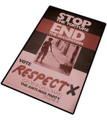 |
Poster
Client: Respect (national political party)
Design: courtesy of US Army Corrective Unit, Abu Graibh, Iraq
Quantity: 16,000
Date: 2004
|
Technical: Two colours (pans 3425 & 1795) to create a sepia duotone. A2 on 280 micron uncoated pulpboard.
Commentary: Whilst the technical side is straightforward, the subject matter and the logistics most certainly were not. This is one of the 25 million items we have supplied this year for national, local, and international elections for the party which at the moment, perhaps more than any other, reflects topical politics. As for the logistics of distribution, we manage this to the last detail, and have not let Respect down yet!
top
|
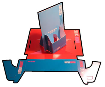 |
Leaflet Dispensers
Client: London Calling
Design: In-house with modifications by Lithosphere.
Quantity: On demand 2000 at a time.
Date: 2003/4
|
Technical: Printed solid colour(s) onto 170gsm gloss art, mount onto 230 micron FBB board, make cutter, die cut and kiss cut.
Commentary: Two samples out of a series over the last couple of years for this leading theatrical marketing agency. This type of product requires specialised print management experience, highly professional attention to detail, plus an ability to think very precisely in three-dimensional engineering terms, in order to get the job absolutely right every time, and make the most economic use of press and cutting machine dimensions.
top
|
Exhibition Catalogue
Client: Institute of Contemporary Art
Design: Neville Brody, Research Studios
Quantity: 1,500
Date: 2004
Technical: A3 portrait inner: Cover is full colour on 350gsm matt coated and matt laminated. 20pp text is full colour on 250gsm gloss coated. A4 landscape wrapper: Cover is full colour with seal on 350gsm matt and gloss laminated. Text is four colours with seal on 170gsm matt coated. The two parts folded and stitched with outer part centred at spine on inner part.
|
|
Commentary: This prestigious product for the annual landmark Becks Futures exhibition and awards at the Institute of Contemporary Arts is an art work in itself, reflecting in its two elements combined the nature of the exhibition with its dialectic and artists sections. Another triumph for Jim Pennington, our Production Director, working with the celebrated designer, Neville Brody.
top
|
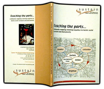 |
Environmental report
Client: Sustain: the alliance for better food and farming
Design: Ian Tokelove
Quantity: 1,000
Published: July 2000
|
Technical: 92pp text, perfect bound with drawn-on cover. Full colour printing plus neutral seal using Soya based inks throughout; text on 130gsm Cyclus Print, cover on 200gsm Cyclus Print; 100% post-consumer waste recycled unbleached matt coated paper. An explicit example of environmentalism in our service; based on a more-than-average knowledge of environmental factors in all aspects of printing processes and materials, which permeates our work.
top |
Copyright © 2008 Lithosphere
Design by Heathcliffe Bird
|


|


